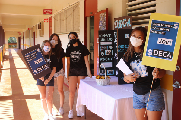
Did you know that the average person will spend eight seconds or less looking at a poster? What’s the difference between a hallway poster that students walk by and one that grabs their attention for all of those eight seconds or longer? Here are seven tips for student leaders to keep in mind for their next posters. The tips also apply to digital posters and street-side ad signs for student events.

- Keep the message simple and to the point. Posters should communicate quickly and directly with the viewer. (Who, What, When, and How much?)
- Be creative and witty. If your poster looks the same as all the others, people may ignore or overlook it.
- Use high contrasting colors between words and background, and avoid lines, shapes and colors that obscure the message or create confusion.
- If shapes are used in the design, keep them to a minimum, and consider using large flat areas of color instead.
- Use a single, easy-to-read font for lettering and avoid ones that use serifs (those little accent lines at the ends of letters as in this Times Roman font example: [T]. Simple block style lettering is great. Remember that you want people to read the posters’ messages in addition to admiring the creativity that went into them.
- Words on the poster should be neatly arranged and of similar sizes (titles and text) to complement the background or any image. Taking care to balance the positioning of words will create a more pleasing overall look and a faster, easier read.
- Always review the poster content and design prior to creating it to ensure correct details and messaging, spelling/grammar, and that there is no unacceptable language or imagery.
Are your student leaders making creative posters? Be sure to tag us when you post them on social media! (#natstuco, @natstuco)

